Movie and film Logo research
Dreamworks Pictures:
- The general idea of this logo was given by Steven Speilberg, who used his son as the model. It was inspired however by Hollywoods golden age. The original logo just composed of big black and gentle lettering. In 2004-2006 Dennis Muren had a different approach and wanted a hand painted picture of moon themed. The series consisted of a man fishing on the moon, but one version consisted of a boy fishing. This is the version that was chosen. This was chosen because, they believed when a person dreams, they become more like a child than a adult and that children's dreams are unlimited. They don’t know about all these material obstacles that may interfere with their desires. Because of this, nothing is impossible to them. In 2007, the color palette was also changed and monochrome got replaced by a calm and strong shade of blue, placed on a white background. in 2016 everything that was sky blue became white and vice versa. The artists corrected the boy’s figure by removing the bend on the trousers, the chin sticking out, and the strand of hair sticking out at the top of the head. He now has cropped trousers, a curved rod, and a cut line. The color scheme has changed several times. They experimented with the palette and background, then removing, then adding clouds. One of the later logos in the word DreamWorks used five colors at once.

Pixar:
1979 – 1986 the company started as Graphic groups. The logo was a simple red and black with smooth lines. as for today, the company still tries to accomplish a basic and simplistic logo to focus the attention on the films and cartoons that they produce. In 1986 Steve Jobs bought the company and changed the name to Pixar and completely changed the logo. It consisted of a grey square with black and white edges and a circular dent in the middle. The letters were separated by small black dots between each letter. In 1994 the new logo was created where there is noticeable detail to the ' X' as its bottom right part is pointed, the same as the 'R'. The logo was first introduced during the release of Toy Story. The company then replaced the letter 'I' with what looks like a lamp. The lamp is known as Luxo Jr., as the lamp was featured in the very first short movie released by Pixar. Luxo Jr. is now presented at the beginning of each Pixar film.


Walt Disney:
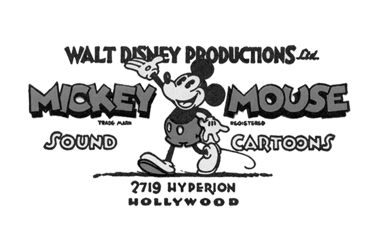
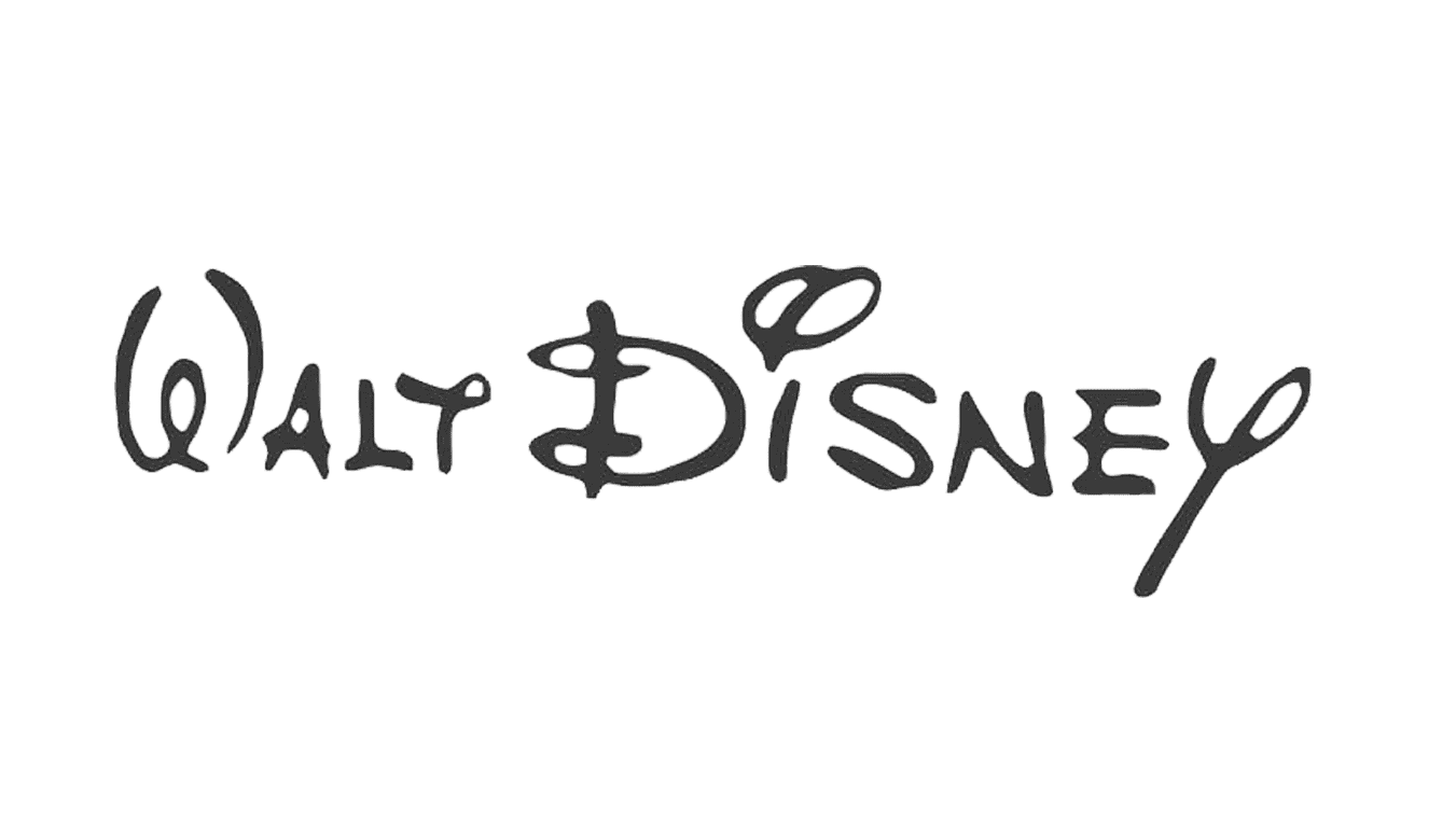
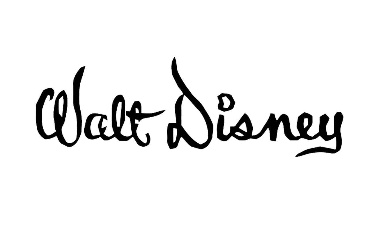
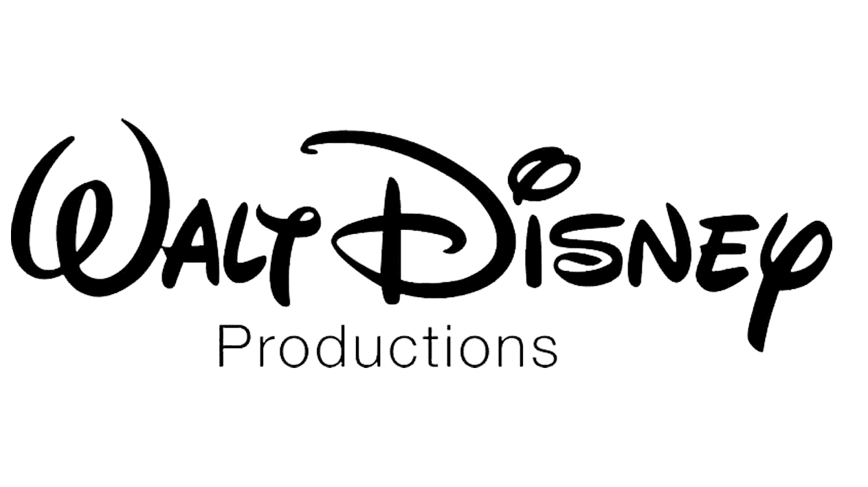
- The company made their logo with their mascot mickey mouse on it. After this, Walts passion and love for calligraphy came out through the next logo, which is still used and shown today. It has a fun and quirky element to is which makes it appealing to families and children. The next Gothic type font that is used has hard and sharp edges, which is represent fictional period fantasies like sleeping beauty and other princess movies. The logo after this is the reflection of the brands capabilities. They refined the calligraphy and despite it being altered her and there, it has remained the foundation/blueprint of the logo. In 1983, Disney merged its live-action and animation productions and created Walt Disney Pictures. Disney changed the font for the 'pictures' to represent and display a more modern look. In 1985-2006, the famous castle was added to the logo, as the theme parks and resorts attracted families , and the brand recognition was growing. The castle is symbol that represents both the massive theme parks and the popular princess movies. In 2006- 2011, Disney highlighted and enhanced the castles importance by adding more detail and making it more realistic. The addition of the shooting star adds the element of magic that Disney is known for creating in all their films. In 2011, Disney made the logo look simple by removing most of the text and just keeping “Disney.” The company’s theme parks, movies and films, as well as live performances have increased its global recognition, so much so that consumers can identify the Disney logo simply by looking at the castle.


Universal Studios:
- With more than ten redesigns made to its logo through their history, all the versions were based on the same idea with the globe as the main graphical element, showing and displaying that their films and movies will be enjoyed worldwide. At the beginning, the logo was a thick black orbit and then soon developed to be a black and white globe with the words Universal Films. They then later didn't use the globe but rather incorporated as circle in the middle of it, to represent the globe. In 1923, the logo became more modern and lighter with lettering orbiting around the globe. The redesign that was closely followed made it flat however. Another versio9n of the logo came out where the globe was surrounded by a black ribbon which had the name of the company on it. The name then changed to Universal International, and the U was the most emphasized. Shortly after the name changed to Universal Pictures and this was very memorable even thought the logo lasted a short while. The new era for the visual identity design started in 1990 when it was shortened to just “Universal” in all capitals. Later details were removed to make it more simplistic. The current version of the Universal logo was designed in 2012. It displays a minimalist and sleek globe drawing in black and white, with the word “Universal” slightly arched. This reflects confidence and professionalism, while the arched placement adds playfulness and shows the unique character of the company, highlighting its creativity and value of style.

Columbia:
- Before the film studio got its current name, it stood for Cohn brothers and Joe Brandt, which were the people who founded the company. The company was renamed in 1924 and this is when the first official Columbia Pictures logo was introduced. It was consisted of an image of the Roman Warrior Lady with a shield in one hand and a wheat spike in the other. In 1925 the logo was refined and modernized, by creating an oval emblem and a black background, making the image look stronger and more confident. The iconic figure: 'Lady with a Torch' made its first appearance on the company’s logo in 1926. It was also circular with a black background and the Lady's arm is outstretched as she holds the torch. The logo was redesigned again in 1932 where it changed to be red and got more modern and distinct. In 1932, the emblem looked rather similar to that of before, it looked more powerful and professional in the combination of black and white colors, evoking a sense of influence and authority. In 1936, the circular logo was changed for the rectangle one, where the rays became bolder. However, in 1938 the company comes back to the shape of the circle. The logo was simplified through the delicate silhouette of the lady, surrounded by the rays. In 1964, the Lady with the torch was ditched at replaced a a simplistic torch and the letter C in black and white. The logo however, in1975 looked like it represented a torch, by the beam of sharp rays. It was bright, powerful and stylish. The Lady with the torch was rein introduced in 1981, but this time, incorporated her whole body. However, the photographer who helped bring this latest and greatest version of the Torch Lady was Kathy Anderson, who was good friends with Michael ( artist). The logo can now be recognized or associated with the Statue of Liberty, as the painting consists of a glowing sunset and fluffy clouds that surround a beautiful woman. Just like the Statue of Liberty, she lifts one arm bearing a torch and wears a flowing robe. She is often called the warrior goddess/queen or the torch lady, which the figure in the logo actually represents. She is also depicted as a beautiful heroine. The latest version of the logo is clear, modern and colorful as the rays depict a hint of rainbow.


Our Logo: Sensational Studios
- We wanted for our films and therefore brand image to be associated with top and the highest quality and prestige, which will be accomplished via our logo. We want all our audience to feel from the start that they are receiving professional and outstanding piece of entertainment. With this being said, we will incorporate a elegant and refined black and gold logo which reflects the high quality product that we offer. Chanileze Roberts has already made our logo, in which our vison has been carried out and accomplished.

Comments
Post a Comment